

The most common mistakes law firms make with their websites are not always obvious.
Your website can look professional, load properly, and still do very little for your firm.
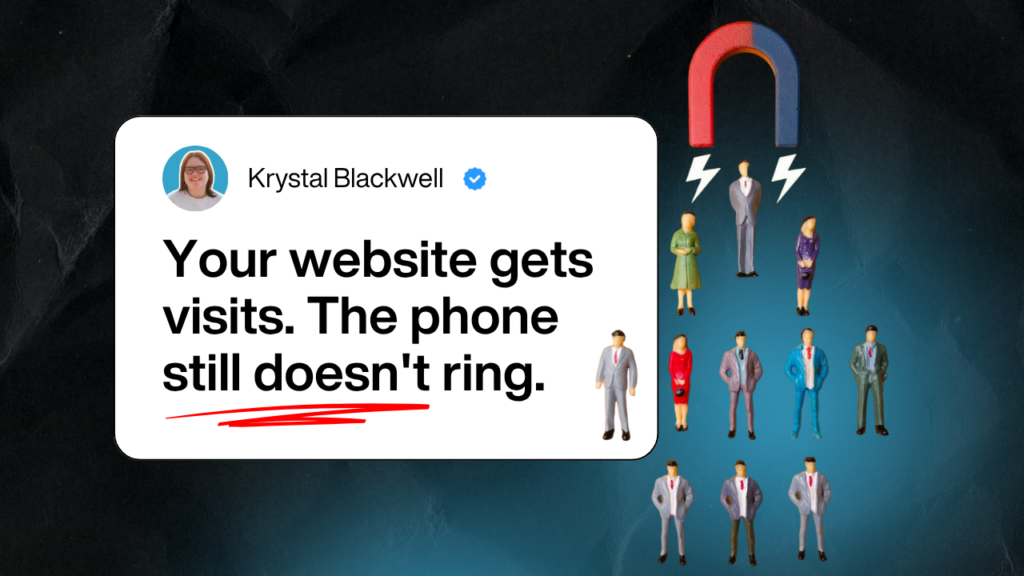
That is the frustrating bit.
You might have paid for a redesign. You might have service pages for every department. You might even get a decent amount of website traffic each month.
But if the phone is quiet, the contact forms are not coming through, and most new work still depends on referrals, something is leaking.
For many law firms, the website has become a digital brochure. It explains who you are. It lists what you do. It looks respectable.
But it does not help enough visitors take the next step.
This article breaks down the most common law firm website mistakes, why they matter, and what to fix first if you want your website to generate more enquiries.
Contents
- Why law firm websites fail to generate enquiries
- The real cost of website mistakes
- The 7 most common law firm website mistakes
- Brochure website vs enquiry-generating website
- How to check your law firm website in 15 minutes
- What to fix first
- FAQs from law firm owners
- Final takeaway
Why law firm websites fail to generate enquiries

Most law firm websites are built around the firm.
That sounds logical at first.
You want to show your experience. Your team. Your services. Your accreditations. Your office locations. Your history.
But your visitor is not thinking about any of that first.
They are thinking:
- Can you help me?
- Do you understand my situation?
- Are you the right type of solicitor?
- What will this cost?
- What happens if I get in touch?
- Will I be judged?
- How quickly can I speak to someone?
That is especially true in legal services.
Someone looking for a family solicitor may feel anxious. Someone looking for an immigration solicitor may feel under pressure. Someone looking for commercial legal advice may need confidence that you understand their sector.
A referred client arrives with some trust already built.
A website visitor does not.
Your website has to build that trust from scratch.
That is where many law firm websites fall down.
They look credible, but they do not answer the questions a cautious client needs answered before making contact.
The real cost of website mistakes
Website mistakes cost more than a few lost clicks.
They can affect your whole pipeline.
If your website is unclear, you may be losing people who were already interested. They did not leave because they had no legal need. They left because your website did not make the next step easy enough.
That creates several problems.
You waste money on SEO
SEO can bring more people to your website.
But if those people land on unclear pages, they still do not enquire.
That means you may pay for rankings and traffic without seeing a clear increase in consultations.
You waste money on Google Ads
Paid ads make the problem faster.
If your landing page is vague, your form is hard work, or your CTA is weak, you pay for clicks that do not turn into enquiries.
That gets expensive quickly.
You stay dependent on referrals
Referrals are valuable. But they are hard to control.
If most new work still comes from word of mouth, your firm is exposed when referral sources slow down, retire, move firms, or get busy.
Your website should give you another route to consistent enquiries.
You make sales conversations harder
When your website does not explain things clearly, prospects arrive with more doubt.
They ask basic questions. They compare you harder on price. They are less sure whether you are the right fit.
A clear website helps people arrive warmer.
You lose better-fit clients to clearer competitors
This is the one nobody likes to say out loud.
The firm that wins the enquiry is not always the best firm.
Sometimes it is the firm that explained things more clearly.
The 7 most common law firm website mistakes
1. Your homepage does not say who you help
Many law firm homepages open with something like:
“We are a leading law firm providing expert legal advice to individuals and businesses.”
It sounds fine.
It also sounds like everyone else.
A homepage should help visitors quickly understand whether they are in the right place.
That means it needs to answer:
- Who do you help?
- What do you help them with?
- Why should they trust you?
- What should they do next?
A better homepage headline would be more specific.
For example:
“Family law advice for people who need clear next steps during divorce, financial disputes, or child arrangements.”
Or:
“Employment law advice for business owners who need to deal with staff issues properly before they become expensive.”
Specific beats safe.
2. Your service pages are written like legal summaries
A service page is not there to show how much you know.
It is there to help the right person decide to contact you.
Many law firm service pages are too focused on definitions, process, and technical wording.
That can make the page feel cold.
A good service page should cover:
- The situation the client may be facing
- The risks of leaving it too long
- How your firm can help
- What working with you looks like
- Common questions
- Relevant experience
- Clear next step
For example, a conveyancing page should not only say you handle sales and purchases.
It should explain how you keep clients updated, what can delay the process, what buyers need to prepare, and how to start.
A family law page should not only list divorce, finances, and children matters.
It should help someone feel calm enough to ask for advice.
3. Your website tries to speak to everyone
Most law firms have several audiences.
That can include individuals, families, business owners, landlords, employers, employees, executors, buyers, sellers, and overseas clients.
But if your website speaks to everyone at once, it often connects with nobody.
A visitor should be able to find the page that matches their situation quickly.
For example:
- Employers need different language from employees.
- Landlords need different guidance from tenants.
- Business owners need different reassurance from private clients.
- Family law clients need different support from commercial clients.
Do not make one vague page do too much.
Create clear routes for different client types.
4. Your calls to action are too vague
“Contact us” is common.
It is also weak.
It does not tell the visitor what they are asking for.
A better CTA gives them a clear next step.
For example:
- Request a call back
- Book an initial consultation
- Speak to a family solicitor
- Ask about your immigration matter
- Get conveyancing support
- Talk to us about your employment issue
The CTA should match the service.
A family law visitor may need reassurance.
A commercial client may want a consultation.
A conveyancing client may want a quote.
Different intent needs different wording.
5. You hide trust where people need it most
Many law firms have reviews, accreditations, years of experience, case examples, or testimonials.
But they often sit in the wrong places.
Trust needs to appear near the decision.
That means near:
- Homepage headline
- Service page introductions
- Consultation CTAs
- Contact forms
- Pricing information
- Team profiles
If someone is reading your employment law page, show employment law trust signals there.
If someone is deciding whether to contact your immigration team, show relevant immigration reviews or experience on that page.
Do not send visitors hunting for reassurance.
6. Your contact process feels like hard work
Legal enquiries can feel sensitive.
If your form asks too much too soon, people hesitate.
Common contact issues include:
- Long forms
- No response time
- No confidentiality reassurance
- No clear phone number on mobile
- No call-back option
- No message after form submission
- No explanation of what happens next
Your form should ask for the minimum needed to start the conversation.
Usually:
- Name
- Phone
- Area of law
- Short message
You can gather more detail later.
The first step should feel easy.
7. You have no follow-up after the enquiry
This is where many firms lose enquiries they have already earned.
Someone fills in a form. Then the process depends on who sees the email, how busy the team is, and whether anyone follows up.
That is risky.
Every enquiry should trigger:
- An immediate confirmation message
- A clear internal notification
- A same-day response where possible
- A follow-up if the person does not reply
- Tracking so you know where the enquiry came from
Good follow-up does not need to be pushy.
It needs to be organised.
Brochure website vs enquiry-generating law firm website
Here is the simple difference.
| Brochure law firm website | Enquiry-generating law firm website |
| Talks mostly about the firm | Speaks to the client’s situation |
| Lists services | Guides people to the right service |
| Uses vague headlines | Says who the firm helps and with what |
| Hides reviews on a separate page | Places trust near key decisions |
| Uses “Contact us” everywhere | Uses specific next steps |
| Tracks traffic | Tracks enquiries and source |
| Stops after the contact form | Follows up after enquiry |
| Looks professional | Helps people decide to contact you |
This is the shift most law firms need.
You do not need a louder website.
You need a clearer one.
How to check your law firm website in 15 minutes
You can spot the main leaks quickly.
Set a timer for 15 minutes and check these areas.
1. The homepage test
In the first 10 seconds, can a visitor tell:
- What type of law firm you are?
- Who you help?
- What problems you solve?
- Why they should trust you?
- What to do next?
If not, your homepage needs clearer messaging.
2. The service page test
Pick your most important service page.
Ask:
- Does this page speak to a real client problem?
- Does it explain what happens next?
- Does it answer common questions?
- Does it include relevant trust signals?
- Is there a clear CTA above and below the main content?
If the page only describes the legal service, it is probably underworking.
3. The mobile test
Open your website on your phone.
Check:
- Can you read the text easily?
- Is the phone number easy to tap?
- Does the CTA stay visible?
- Is the form easy to complete?
- Do pages load quickly?
Most visitors will judge your site on mobile.
4. The trust test
Look at one key page and ask:
- Where is the first review?
- Where is the first solicitor profile?
- Where is the first result or case example?
- Where is the first accreditation?
- Does the trust support the claim being made?
If trust is buried, move it closer to the decision.
5. The enquiry test
Submit your own contact form.
Then check:
- Did the form work?
- Did the email arrive?
- Did it go to the right person?
- Did you receive an automatic reply?
- Did the thank you message explain what happens next?
- Was the enquiry tracked?
This is boring.
It is also where money leaks.
What to fix first
Do not start with a full redesign unless the site truly needs one.
Start with the parts that affect enquiries fastest.
1. Fix the message
Make the homepage and key service pages clearer.
Focus on:
- Who the page is for
- What problem they have
- What outcome they want
- Why your firm is credible
- What the next step is
This is the foundation.
2. Fix the key service pages
Do not try to rewrite the whole website at once.
Start with the pages that matter most commercially.
For example:
- Family law
- Conveyancing
- Employment law
- Immigration
- Commercial litigation
- Wills and probate
Improve one page properly before moving to the next.
3. Add trust near calls to action
Move reviews, solicitor experience, accreditations, and client comments closer to the point of enquiry.
Trust should not be decorative.
It should help people decide.
4. Simplify the enquiry process
Reduce friction.
Make the form shorter. Make the phone number obvious. Explain response times. Add a useful thank you page.
A small improvement here can make a big difference.
5. Set up tracking
Track the actions that matter.
That includes:
- Form enquiries
- Phone clicks
- Booked consultations
- Practice area source
- Page source
- Campaign source
Traffic is useful.
Enquiries are the number that matters most.
6. Add follow-up
Create a simple process for enquiries that do not respond straight away.
For example:
- Day 0: immediate confirmation
- Day 1: personal response or call
- Day 3: polite follow-up
- Day 7: helpful nudge
- Day 14: final check-in
This keeps warm enquiries from going cold.
Final takeaway
Most law firm website mistakes come back to the same three problems.
The message is not clear enough.
The decision path is not easy enough.
The follow-up is not strong enough.
That is why a website can look professional and still generate very few enquiries.
The fix is not always a full redesign. And it is not always more SEO, more ads, or more content.
Start with the page your best clients are most likely to visit.
Ask:
- Is it clear who this is for?
- Does it speak to the client’s real situation?
- Does it build trust at the right points?
- Is the next step obvious?
- Does every enquiry get followed up?
If the answer is no, you have found the leak.
And once you find the leak, you can fix it in the right order.
If your law firm website looks fine but does not bring in enough enquiries, book a More Clients Through Your Website Call.
We will look at what is blocking enquiries, what to fix first, and what can wait.