
Is your website losing you clients you should be winning?
This free checklist covers the 10 mistakes we see on almost every professional service website, and shows you exactly what to fix first.

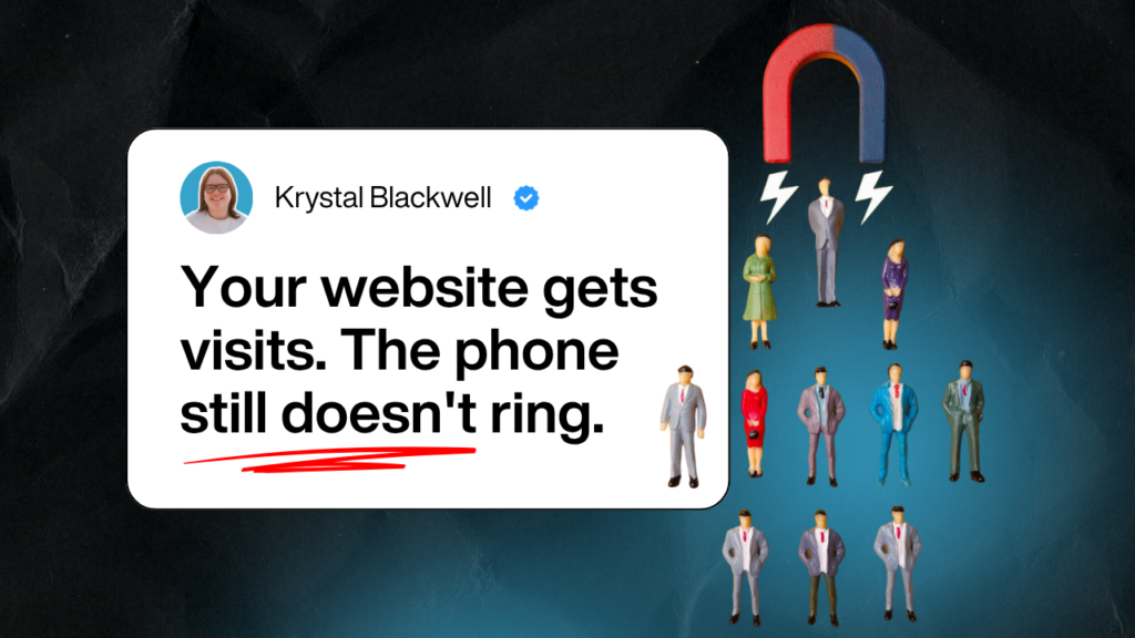
Most professional websites look credible. That is the problem. They look fine — so the owner assumes the website is fine. But looking professional and converting visitors into enquiries are two very different things.
The websites we review most often are not bad websites. They are clean, they load quickly, they describe the services clearly. But they are missing the things that actually make a visitor decide to get in touch, and the owner has no way of knowing that just by looking at it.
The mistakes that cost professional firms the most enquiries are rarely obvious. They are in the message, the structure, the call to action, the follow-up. They are the kind of thing you only spot when you know what to look for.
That is what this checklist is for. It takes around 10 minutes to work through. By the end, you will know which of the 10 mistakes apply to your site, how serious each one is, and where to start fixing.

Note from Krystal
I put this checklist together because I keep seeing the same mistakes on websites that should be performing.
Good firms. Good services. Websites that look professional and produce almost nothing.
The issues are almost always the same. And they are almost always fixable. Tick through the checklist and you will know within 10 minutes which ones are costing you enquiries.
What’s inside this guide:
- Whether your homepage is actually telling visitors what you do, or just describing it
- Why most professional sites get compared on price, and what changes that
- Where proof needs to sit on your pages to actually influence a decision
- What your call to action is really communicating to someone who has never heard of you
- Whether your website has a follow-up system, or is relying on hope