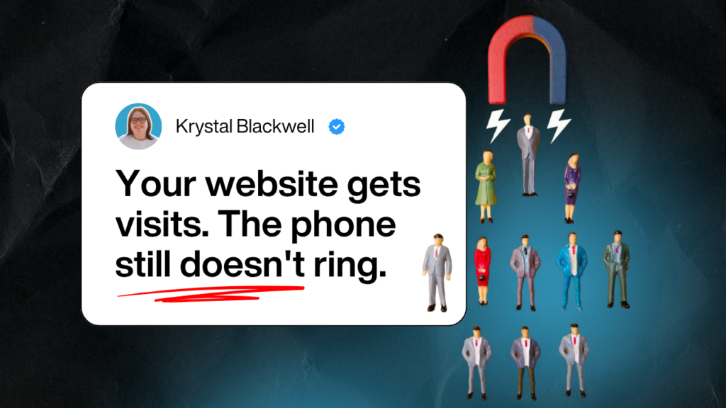


Is your website bringing you more clients through your website, or is it just sitting there?
If you’ve been told “it just takes time”, but months later you’re still relying on referrals, you’re not the problem. The website is.
Most professional service firm websites look professional. But they don’t create consistent enquiries. You might get the odd lead, a bit of traffic, and some nice comments. Still no predictability.
That’s because many sites are built to look credible, not to guide the right people to enquire.
In this guide, I’ll show you what’s really stopping enquiries, and what to change so your website becomes a reliable source of qualified leads.
Why most professional service websites don’t get enquiries
You didn’t go into law or consulting to think about websites.
You hired someone.
They built something that looked the part.
Everyone nodded. Job done.
Except nothing really changed.
Because a lot of agencies are very good at building websites that look right.
They’re much less good at building websites that do anything.
So you end up with pages full of:
- polished language
- broad promises
- lots of “we”
- and very little that helps someone think,
“Ah. This is for me.”
This is what I see most often:
- The homepage could belong to almost anyone.
- The service pages explain what the firm does — not what the client actually gets.
- The next step exists, technically… but you have to look for it.
And behind the scenes?
No clear tracking. No visibility. Just a quiet sense that it should be doing more.
The frustrating part is it doesn’t feel broken enough to fix.
So it just sits there.
That’s when people start blaming traffic.
Traffic isn’t the issue.
Clarity is.
What actually turns visitors into clients
This is where people expect something clever.
It isn’t.
Websites that get enquiries do a few very ordinary things.
They just do them in the right order.
- They make it clear who they’re for.
- They make the next step obvious.
- And they don’t drop the ball once someone reaches out.
That’s it.
When those things line up, enquiries stop feeling random.
You start seeing the same types of people, asking similar questions, for similar reasons.
That’s when things calm down a bit.
Most websites jump straight to the last part.
They stick a form on the page and hope.
Which is fine — until you realise the rest of the site hasn’t done any of the work yet.
More traffic won’t fix that.
Better SEO won’t fix that either.
You have to fix what’s happening before the form.
The three things your website must do
I know this looks like a framework.
It’s not meant to be one.
It’s just how this tends to play out.
1. Say the right thing to the right people
Your homepage has a few seconds.
Not minutes. Seconds.
In that time, someone’s trying to work out:
- Is this for me?
- Can they actually help?
- Is this worth my time?
If they have to scroll to understand that, they usually don’t.
This is where a lot of sites fall over.
They say things that sound safe.
“Trusted.”
“Experienced.”
“Comprehensive.”
All technically true.
Also completely forgettable.
Specific works better. Every time.
Not clever.
Not impressive.
Just clear.
2. Make the next step obvious
After reading your homepage, what should someone do?
There should be no debate.
- Book a call.
- Send a message.
- Ask a question.
One option. Easy to see. Easy to do.
When there are too many choices, people pick none of them.
That’s not a motivation issue. It’s a clarity issue.
3. Show up where buyers already look
This is the bit people like to overcomplicate.
Your clients are already searching.
They’re already asking questions.
They’re already comparing options.
Your website’s job is to show up in those moments with something that makes sense.
Not sales language.
Not buzzwords.
Just answers.
Do that consistently, and enquiries don’t feel like something you’re chasing.
They feel like something that happens.
Homepage: The 7-Second Test
Your homepage is not a brochure.
It’s a filter.
It should let the right people know they’re in the right place — fast.
Here’s a quick test.
Show your homepage to someone who doesn’t know your business.
Give them eight seconds.
Then ask:
- Is this for me?
- Can they help?
- What should I do next?
If they can’t answer all three, your homepage is leaking enquiries.
What to fix
- Lead with who it’s for – “We help established law firms get more clients through their website” beats “Welcome to our award-winning legal practice.”
- Be specific, not impressive – Drop the corporate speak. Say what you actually do in plain English.
- One clear call to action – Not three. Not five. One.
Think of your homepage like a shop window.
You’ve got seconds to make someone stop and think, “This might be what I need.”
If they’re squinting at vague promises or hunting for what you actually do, they’re already moving on.
Service pages: Where trust gets built or lost
This is where you either earn trust, or lose it.
Most service pages are written like this:
- Here’s what we do
- Here’s our process
- Here’s why we’re qualified
All fine. All necessary.
But none of it answers the question your visitor is actually asking:
“Will this solve my problem?”
That’s the only thing they care about.
What to fix
- Start with the problem – Show them you understand what they’re dealing with.
Not: “We provide comprehensive employment law services.” Try: “Your employee’s threatening a tribunal claim. You need this sorted properly — and quickly.” - Explain what changes. – Not what you do — but what the client gets.
- Use real examples. – Case studies. Client stories. Numbers. Anonymous testimonials don’t cut it.
People want to see that someone like them got a result.
About page: Stop talking about yourself
I know. It’s called the “About” page.
But it’s not really about you.
It’s about whether the visitor can trust you.
Whether you’re the right fit.
Whether they want to work with you.
Most About pages read like CVs.
Qualifications. Awards. Years in business.
Useful.
But cold.
What works better:
- Start with why you do this. – Not your life story, just what drives you.
- Show you understand their world. – The problems they face. The results they want.
- Make it human. – Use your name. Your photo. Your voice.
People buy from people.
Not faceless firms.
Contact page: Make it stupid easy
This should be the simplest page on your site.
And yet it’s where so many firms overcomplicate things.
What not to do
- Hide your phone number
- Ask for 15 fields
- Make people choose enquiry types
- Bury the form at the bottom
What to do instead
- One form. Three fields. – Name. Email. Message.
- Put your phone number front and centre. – Some people want to call. Let them.
- Set expectations. – “We’ll reply within 24 hours” beats silence.
- Remove friction. – Every extra step is a leak.
The follow-up system nobody talks about
You’re getting enquiries. Some of them, anyway.
But what happens next?
- Do they sit in an inbox?
- Get forwarded around?
- Fall into a black hole?
This is where a lot of firms lose clients without realising it.
The website does its job.
The enquiry comes in.
And then… nothing.
What to fix
- Track where enquiries come from. – Not all enquiries are equal.
- Set up notifications. – Someone should know immediately when an enquiry arrives.
- Follow up fast. – Hours, not days. You don’t need a perfect response, You just need to show you’re paying attention.
- Use a simple CRM.
If your system is “we try to remember,” you’re losing clients.
How to know if your website is actually working
If you can’t measure it, you can’t improve it.
You should have a rough handle on:
- how many people visit
- how many enquire
- where enquiries come from
- which pages matter
You don’t need to be a data analyst.
You just need visibility.
Once you have that, decisions get easier.
What to fix first
If you’re wondering where to start:
- Fix your homepage.
- Fix your service pages.
- Check your contact page and follow-up.
- Set up tracking.
- Tweak, measure, repeat.
You don’t need to rebuild everything.
Just fix the leaks.
Final thought
At the end of the day, most professional service websites aren’t broken, they’re just not built with clear goals in mind. Now that you know what causes the leaks, you can start fixing them without overhauling everything.
You came here because your website isn’t generating consistent enquiries, and you’re tired of wondering if it’s actually doing anything. You now know the small but critical changes that move the needle: clarity, next steps, and smart follow-up.
If you’re ready to get more clients through your existing website, without jumping into a full rebuild — your next step is simple: Book a More Clients Through Your Website Call. It’s a quick way to find your biggest opportunities and get a clear plan to move forward.
This guide comes from working directly with firms like yours — ones that felt stuck with their website until small changes made a big difference.
We’ve seen this play out many times. We can help you do the same.