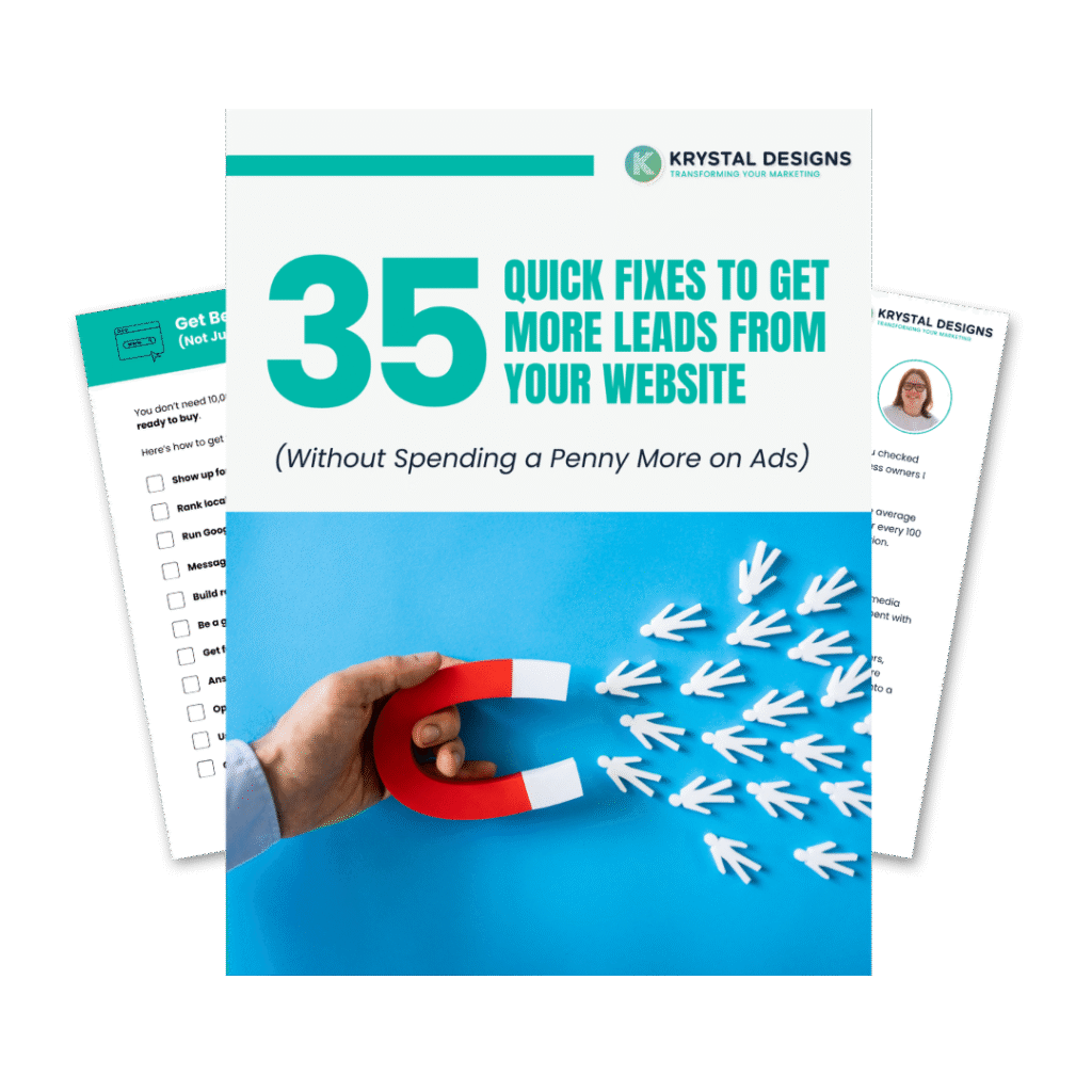
Have you invested in a “professional-looking” website that still delivers zero new client enquiries?
Are you worried about wasting thousands again on a design that looks nice but doesn’t bring in qualified leads?
This guide breaks down the critical mistakes that quietly reduce conversions—and shows you how to create a website that consistently generates enquiries, builds trust, and supports your firm’s long-term growth.
By the end, you’ll know:
- What every high-converting professional website must include
- Silent issues that cause visitors to leave without enquiring
- The difference between brochure sites and enquiry-generating systems
- Real-world examples from firms that fixed these issues and saw results
- How to assess whether your current site is helping or holding you back
Mistake 1: No Clear Offer or Conversion Pathway
Many professional websites rely on a generic “Contact Us” button, without explaining what the visitor will receive or what happens next.
Why This Matters:
Visitors don’t arrive looking to “contact” you. They’re trying to solve a specific legal, financial, or business problem. Without a compelling offer or a clear next step, they leave uncertain and move on.
Fix This:
Replace vague CTAs with outcome-driven offers. For example:
- “Free 30-Minute Employment Law Review”
- “Business Tax Health Check – No Obligation”
- “Book a Divorce Options Call Today”
Then, explain what happens after they enquire. Clarify that they’ll get helpful, no-pressure guidance, even if they don’t become a client.
Mistake 2: Proof is Hidden or Missing
Professional service buyers are skeptical, especially if they’ve had poor experiences before. If your social proof, credentials, or case studies are buried on an About page or testimonials tab, they likely go unseen.
Why This Matters:
Without visible proof, prospects assume your firm is similar to others making bold claims. Even great firms can appear unproven if their evidence is hidden.
Fix This:
- Showcase results on service pages: “Saved £47k in corporation tax for Johnson Ltd”
- Include named testimonials with photos or logos where possible
- Highlight awards, credentials, or affiliations above the fold
- Use short case study callouts to build confidence early
Make sure these elements appear where decisions happen, not just on a standalone testimonials page.
Mistake 3: Messaging That Doesn’t Match the Client’s Language
Many firms default to formal, brochure-style copy. But your prospective clients are typically stressed, time-poor, and focused on solving a specific issue, not reading corporate-speak.
Why This Matters:
If your messaging sounds like everyone else’s—or doesn’t reflect the way real clients talk, you’ll struggle to connect.
Fix This:
Use the language your clients actually use when they describe their problem. For example:
- Instead of “Commercial Restructuring Services” → “Help When Business Partners Fall Out”
- Instead of “Strategic Tax Planning” → “Keep More of What You Earn”
- Instead of “Business Consultancy” → “Get Unstuck and Grow Again”
Tip: Read actual enquiry emails or intake forms to hear how clients describe their issues.
Mistake 4: Poor Mobile Experience and Slow Load Times
If your website loads slowly or doesn’t function well on mobile, many visitors will never reach your enquiry form.
Why This Matters:
Professional buyers often research between meetings, on mobile. If your site takes more than 3 seconds to load, or forms don’t work well on phones, you’re losing potential enquiries before they even begin.
Fix This:
- Use Google PageSpeed Insights to test your mobile speed
- Ensure forms are easy to complete on small screens
- Make phone numbers clickable for one-tap calls
- Test your entire contact flow on a mobile device regularly
Mistake 5: CTAs That Don’t Reduce Risk
Buyers in legal, financial, or consulting fields often hesitate to enquire because they fear being pushed into a high-pressure sales process.
Why This Matters:
Uncertainty leads to inaction. If your CTAs don’t address concerns like time, cost, or pressure, many qualified leads will walk away.
Fix This:
Use CTAs that remove perceived risk:
- “Book a No-Pressure Strategy Call”
- “Free Review – No Obligation”
- “Ask Us Anything – No Sales Pitch”
Then, explain the process clearly:
“We’ll listen, share your options, and let you decide next steps—no pressure, ever.”
Mistake 6: No Tracking of Form Drop-Off
You might know how many people visit your contact page, but do you know how many start filling out the form and then abandon it?
Why This Matters:
Form abandonment is a silent leak. If half of visitors start your form but never finish, something in the experience is blocking conversions.
Fix This:
- Track form starts and completions using Google Analytics
- Aim for at least a 70% completion rate
- Simplify long forms: 3–4 fields max
- Use dropdowns instead of open fields when possible
- Add progress bars for multi-step forms
Even small improvements can make a measurable difference in form completion rates.
Mistake 7: Sending Paid Traffic to Generic Pages
Running Google Ads or LinkedIn campaigns? If you’re sending traffic to your homepage instead of dedicated landing pages, you’re likely wasting the budget.
Why This Matters:
Someone searching “immigration solicitor Manchester” doesn’t want to land on your generic homepage. They want immediate proof that you help people like them.
Fix This:
- Build dedicated landing pages by service and location
- Match the page copy to the exact language in your ad
- Remove distractions (like navigation menus)
- Focus the page on one clear action: enquire, book, or call
Firms that implement this often see double or triple, their enquiry rates from paid ads.
Self-Assessment Checklist: Is Your Website Costing You Clients?
Ask yourself:
- Can visitors understand your offer within 10 seconds?
- Are results, reviews, and proof visible without clicking away?
- Is the mobile experience flawless?
- Does your site load in under 3 seconds?
- Do your CTAs reduce fear or hesitation?
- Are you tracking form start-to-submit rates?
- Do your paid ads lead to focused landing pages?
If you answered “No” to more than 2 questions, these issues are likely reducing your enquiry volume.
What Good Looks Like
High-converting websites in professional services typically include:
- A clear offer that matches client intent
- Visible proof woven into key pages
- Client-first messaging (not just credentials)
- A risk-free enquiry process
- Seamless mobile performance
- Fast load speed
- Simple, smart enquiry forms
- Landing pages tailored to specific search intent
These elements turn websites from static brochures into systems that bring in new business consistently.
Conclusion: Fix the Silent Leaks and Turn Your Website Into a Lead-Generation Engine
Many firms assume their website looks professional, yet still struggle to generate enquiries.
Now that you’ve seen what silent issues to look for and how to fix them, you’re in a stronger position to take action.
Whether it’s rewriting your CTAs, showcasing proof, or tightening up mobile forms, each small change can compound your results.
Next step:
If you’d like expert eyes on your site, book a “More Clients Through Your Website” session. We’ll walk you through exactly what to fix, no sales pitch, just practical help.
You don’t need a full redesign. You need a system that removes friction and earns trust from the first click.


