 (2)")
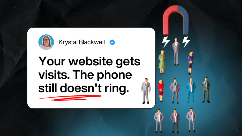
If your website is not generating leads, the problem is usually one of three things. Your message is unclear, your decision path is weak, or your follow-up is leaking good enquiries after they come in. For most law firms and professional services firms, it is not a traffic problem first. It is a website foundations problem first.
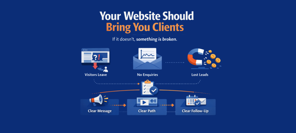
A working website does three jobs. It tells the right person they are in the right place. It makes the next step feel easy. It makes sure genuine interest turns into a real conversation. If one of those breaks, enquiries slow down. If all three break, your site becomes a brochure with a monthly hosting bill.
That is the pattern I see over and over again. The website looks professional. People visit. Nothing happens. Then the firm starts guessing. More SEO. More ads. A redesign. Another agency. Still no clarity on what to fix first.
At Krystal Designs, we call these three foundations Message, Decision Path, and Follow-Up. They sit inside EnquiryOS™, the framework we use to help professional firms get more of the right enquiries through their website.
Why is your website not generating leads?
Your website is not generating leads because it is failing at one or more key decision points.
A professional services website does not need to entertain people. It needs to help them decide. When someone lands on your site, they are trying to answer three questions quickly:
- Is this for me?
- Can I trust these people?
- What do I do next?
If your site does not answer those questions fast, people leave. They do not send feedback. They do not tell you what confused them. They just go.
That is why a good-looking website is not the same as a working website. Plenty of sites look polished and still produce no enquiries.
 1")
What does message mean for lead generation?
Message is the part that makes the right visitor recognise themselves.
If your homepage is vague, firm-centred, or full of generic claims, people cannot tell whether you help people like them. That is where most leaks start.
The strongest homepage message answers this in five seconds:
- Who do you help?
- What do you help them with?
- Why should they choose you?
Most firms skip that and talk about themselves instead. Years of experience. Trusted team. Professional service. The problem is that none of that helps a busy buyer decide whether to stay.
A clear message reduces doubt. A weak message creates more of it.
Signs your message is the problem
- Your homepage headline could belong to any firm in your sector
- You talk more about your firm than the client’s problem
- Service pages explain what you do, but not why it matters
- You get traffic, but poor-fit enquiries or none at all
Your website should make the right person feel, “This looks like it is for someone like me.”
What does decision path mean for lead generation?
A decision path is the sequence of steps a visitor takes from landing on your website to submitting an enquiry.
Most professional services websites make at least one of those steps too hard.
A visitor should not have to hunt for the next step. They should not have to read five pages to work out how to get in touch. They should not have to choose between multiple unclear options.
Decision path problems usually show up as friction:
- unclear page structure
- weak or vague calls to action
- trust signals in the wrong place
- contact forms that feel like work
- pages that explain too much and guide too little
The best pages do not just provide information. They move a decision forward.
Signs your decision path is the problem
- People land on service pages and leave
- Your contact page gets little traffic
- Important proof sits buried on an About page
- Your main button says “Contact us”
- Mobile visitors drop off quickly
A clear next step increases enquiries. A muddy next step increases hesitation.
What does follow-up mean for lead generation?
Follow-up is what happens after someone shows interest, and most firms lose more leads here than they realise.
This is the part many agencies ignore. They stop at the form submission and call the job done. The client experiences what happens after.
- Did they get a confirmation?
- Do you know the form worked?
- Who gets alerted?
- How fast do you reply?
- What happens if they enquire outside working hours?
Good leads often go cold because the follow-up is too slow or inconsistent.
For professional firms, this matters more than people think. Buyers often contact two or three firms. The one who replies clearly and quickly has an advantage.
Signs your follow-up is the problem
- Form submissions go into one inbox and get missed
- There is no confirmation email or next step
- Response times vary depending on workload
- No one tracks where enquiries come from
- There is no follow-up after the first reply
A missed lead is rarely a traffic problem. It is usually a handling problem.
What do most firms do wrong when trying to fix this?
Most firms fix the wrong thing first.
They start with tactics. More SEO. More ads. A redesign. More content. The problem is that if the foundations are weak, those things do not fix the leak.
Here is the pattern:
- traffic lands on a weak page
- the page does not make the next step clear
- the enquiry comes in and sits too long
- the firm concludes marketing does not work
It is not that marketing never works. It is that weak foundations make every channel underperform.
That is why we use a fixed order inside EnquiryOS:
- Message first
- Decision Path second
- Follow-Up third
That order matters.
What actually works if your website is not converting?
What works is fixing the website in the order buyers decide.
Start with your key pages. Usually, your homepage and service pages.
Step 1: Sharpen the message
Make it obvious who you help, what you help with, and why you are the right fit.
Step 2: Simplify the decision path
Give each page one clear job. Make the next step easy to see and act on.
Step 3: Tighten follow-up
Make sure every enquiry is captured, acknowledged, and followed up properly.
This is where most firms get clarity. You stop guessing and start seeing what is actually blocking enquiries.
What does this look like in practice?
A real example makes this clearer.
One law firm we worked with, Fountain Solicitors, had a strong reputation but a website generating zero enquiries.
After restructuring their website around Message, Decision Path, and Follow-Up, they went from zero to over 60 enquiries per month.
That growth helped them expand from one office with fewer than 10 staff to five offices across the UK, employing more than 30 people.
This did not change because of a redesign alone. It changed because the website was rebuilt in the right order.
Clearer message.
Stronger path to enquiry.
Better follow-up.
That is what turns a website from something that looks fine into something that actually brings in work.
Your Next Step
Your website should not be the part of your business you quietly ignore. It should help the right people trust you, choose you, and get in touch.
When enquiries feel random, the answer is not more guesswork. It is clarity. Clear message. Clear next step. Clear follow-up.
Book a More Clients From Your Website Call, it’s free. 25 minutes. We look at your website together and you leave knowing what to fix first.