
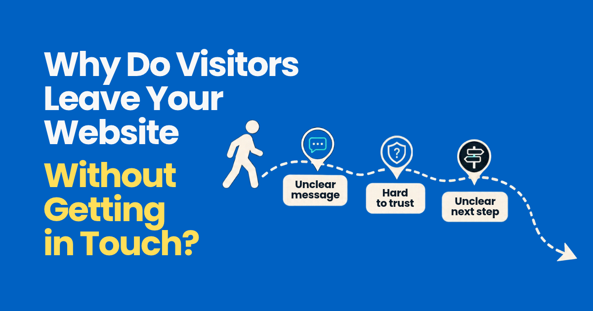
Most visitors leave a firm’s website without getting in touch because they can’t tell quickly if you’re the right firm, can’t find what they came for, or find the next step too much effort. Slow pages on a phone and too little evidence to trust you lose people too. Most of these can be fixed on the website you already have.
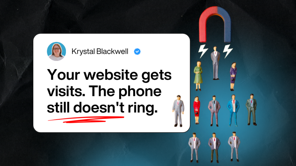
You can see people visiting your website. Your reports show the numbers. But the enquiries don’t match, and you’re left wondering where everyone goes.
Why do so many visitors leave without getting in touch? And is it something about your website, or were they never going to call anyway?
Some visitors will always leave. They were researching, or they weren’t the right fit. But in our experience, many leave for reasons you can fix. This is how website design affects user experience in practice: small barriers add up until a busy person gives up.
By the end of this article, you’ll know the most common reasons visitors leave a professional firm’s website. You’ll also know how to find which ones apply to yours.
Key takeaways
- Most visitors decide quickly whether a website is for them. If the top of the page doesn’t tell them, many leave.
- Confusing menus and pages that don’t work on a phone lose people who were interested.
- Slow pages and hard-to-read text push visitors away.
- People need a reason to trust you before they contact a stranger.
- Free tools can show you where your own visitors leave, so you can fix the right thing first.
In this article
- They can’t tell quickly if you’re the right firm
- They can’t find what they came for
- The site is slow or hard to read on a phone
- They don’t trust it enough to get in touch
- The next step is hidden or too much effort
- How to find where your visitors leave
- Questions people ask about visitors leaving
They can’t tell quickly if you’re the right firm
A visitor arrives with a question in their head. Can this firm help someone like me? If the first screen doesn’t answer that, they often head back to Google.
The most common cause we see is a headline that sounds nice but says nothing. “Excellence in every detail” could be a law firm or a florist.
Compare it with “Employment law advice for small businesses across the Midlands”. A stranger knows straight away if they’re in the right place.
Layout plays a part too. Size, colour and space tell people what to read first. If everything on the page shouts at once, nothing stands out, and the visitor doesn’t know where to look.
Test it: show your home page to someone outside the firm for five seconds. Ask what you do and who for. If they can’t say, start there.
They can’t find what they came for
Once a visitor decides to stay, they go looking. Usually for a service page, prices, the team or how to get in touch.
Menus cause more trouble than most firms realise. Clever labels like “What We Do Best” or “Our World” make people guess. Clear labels like “Services”, “Fees” and “Contact” don’t.
A few habits make a site easier to find your way around:
- Keep the main menu short, with the pages people look for most.
- Use the words your clients use, not internal names for your services.
- Make sure the menu works the same way on every page.
- Link related pages to each other, so people can carry on reading.
- Add a search box if you have lots of articles or resources.
If a visitor needs more than two or three clicks to reach the service they want, many won’t bother.
The site is slow or hard to read on a phone
Many of your visitors will arrive on the phone. A site that looks fine on a laptop can be hard work on a small screen.
Common phone problems include text that’s too small, buttons too close together and forms that are fiddly to fill in. Pop-ups that cover the page are another one, especially when the close button is hard to find.
Speed matters too. If a page takes a long time to appear, some people leave before they’ve seen anything.
The usual causes are large images, too many plugins and heavy scripts. Ask whoever looks after your website to:
- compress images before they’re uploaded
- remove plugins and features nobody uses
- use caching, so pages load faster for returning visitors
- check the main pages in Google’s free PageSpeed Insights tool
Then test the site yourself on your own phone, on mobile data rather than office wifi. That’s closer to what your visitors get.
Make the words easy to read
Even interested visitors give up when reading feels like hard work. Long blocks of text are the main problem. Break pages up with clear headings, short paragraphs and bullet points where a list helps.
Choose a simple font for body text, at a size that’s easy to read on a phone. Make sure there’s strong contrast between the text and the background. Pale grey text on white might look stylish, but many people struggle to read it.
Keep your colours, fonts and layout the same across the site. When every page looks different, people feel lost. When the design is consistent, they learn how your site works and move around it with confidence.
Our guide to the silent website mistakes that cost firms enquiries covers several more of these quick fixes.
They don’t trust it enough to get in touch
Contacting a professional firm can feel like a big step. People want some reassurance first. A website can lose that trust without anyone noticing. Out-of-date news, a copyright year from years ago or a team page with people who’ve left all make a visitor wonder if anyone’s home.
Stock photos can work against you too. Real photos of your people and your office help visitors picture who they’d be dealing with.
Evidence helps most when it sits where people are deciding. Put one or two real reviews close to your contact button, word for word, with the name as it appears on the review site. A short line on how you work, or what happens on a first call, answers the questions people are too polite to ask.
The next step is hidden or too much effort
Sometimes a visitor wants to get in touch and still doesn’t. The route is too hard.
Look for these problems on your own site:
- the only contact link is at the very bottom of the page
- the button says “Submit” or “Learn more”, so people aren’t sure what happens
- the form asks for far more than you need to reply
- the phone number can’t be tapped on a phone
- nobody says how quickly you’ll reply
Each service page should end with one clear next step that fits the topic. “Book a free first call” tells people exactly what they’re agreeing to.
When an enquiry does arrive, the clock starts. Our article on what happened to your last 10 genuine enquiries looks at what happens after someone gets in touch.
How to find where your visitors leave
You don’t have to guess which of these applies to you. A few free tools and an honest test will show you.
Look at where people leave
Google Analytics shows the pages people view most and the pages where many visits end. A service page with plenty of visitors and almost no clicks to the contact page is a good place to start.
Watch real visits
Microsoft Clarity is free. It records how people scroll and click on your pages, with personal details hidden. Watching ten recordings of real visits often shows a problem nobody in the firm had spotted.
Ask five people to try it
Give five people outside the firm a simple task on their phones. For example: “Find out if this firm can help with a lease renewal, then get in touch.” Watch where they hesitate, and don’t help them.
Write down every point where someone paused, guessed or gave up. Then fix the one that came up most often, and test again.
When we review a firm’s website, we start the same way. We go on a phone, from the page most visitors land on, and follow the route a new client would take.
Find out where your visitors leave
This week, ask five people outside the firm to try your website on their phones. Watch where they stop, and fix the most common sticking point first.
If you’d like a second pair of eyes on why visitors aren’t getting in touch, book a More Clients Call. It’s a free call, under 30 minutes, and you’ll leave knowing what to fix first.
Not ready for a call? Read what happened to your last 10 genuine enquiries